Overview
Summary
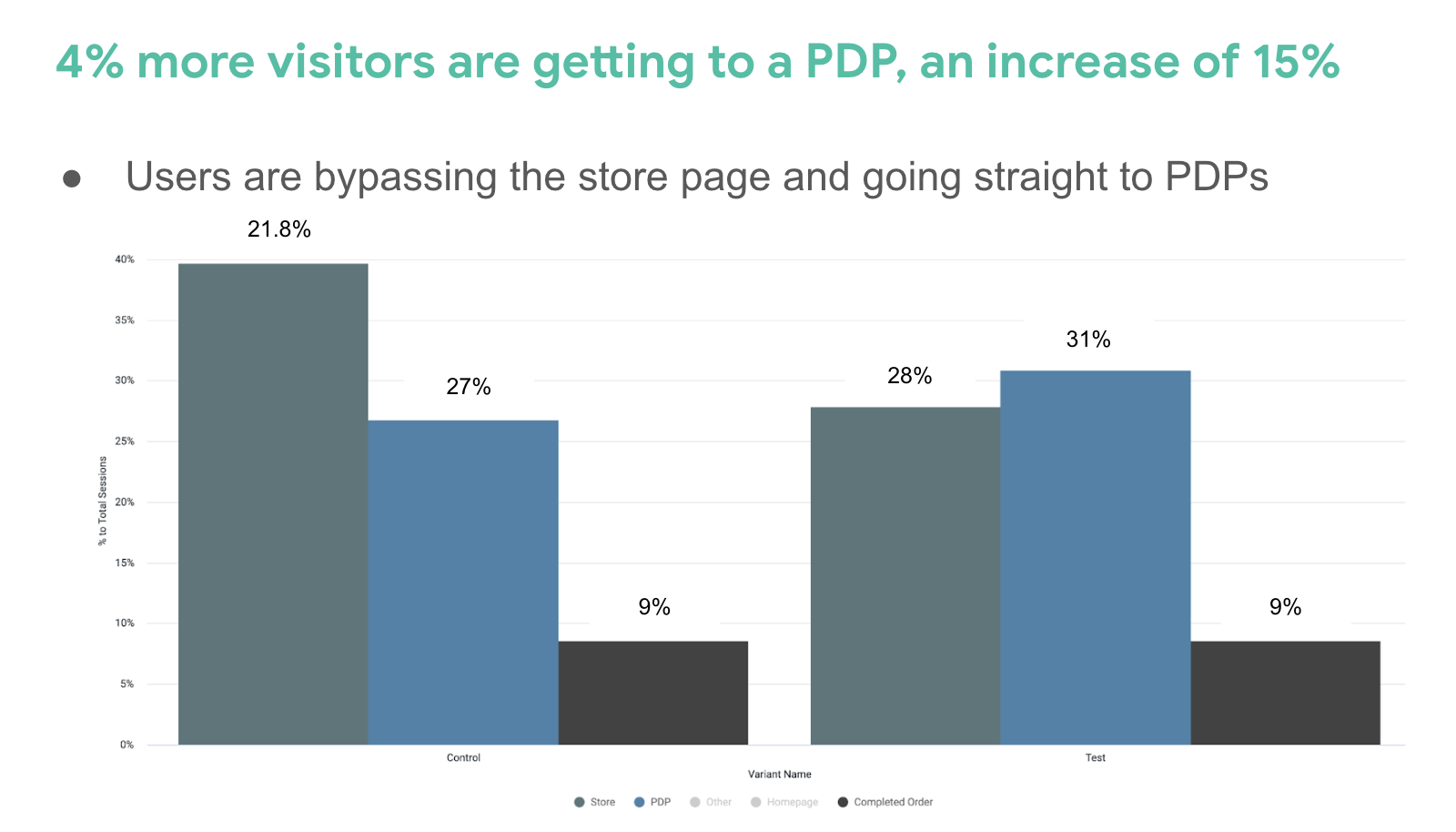
In order to improve discovery, we redesigned our navigation to help users get to product information faster. With our new navigation, we increased our PDP lands by 15% and improved bounce rate by 5%.
Desktop Experience
quip
quip is an oral health care start-up. This project was for our e-commerce website.
My Role
As the digital product designer, I conducted research, led stakeholder workshops, wireframed and prototyped solutions, handed off designs to engineering, creating usage guidelines, and monitored a/b testing. I worked closely with our e-commerce product manager, head of digital, engineering, marketing, and key business stakeholders.
Understanding the Problem
Data
Only 30% of users make it past the homepage
Currently, there is a 70% drop-off rate from homepage to the PLP vs a 6% drop-off from those landing on the PLP
73% of users landing on the homepage are new users. This is a combination of brand new users, and customers who had purchased a quip item from retail.
Over 100,000 people landed on the homepage in the last 30 days *start of the project
User Testing
In order to understand why users were dropping from the homepage, we conducted user testing on our current site. We focused our questions around discovery, and conducted 5 tests on mobile and 5 on desktop using usertesting.com
We gleaned 4 main insights:
Users can’t get to product information easily with one actionable button on the homepage
Users don’t know upfront about the benefits of subscribing and buying bundles
Our navigation doesn’t prioritize the shopping for products, which confuses people
Users can’t quickly get to the product information they are looking for
Problem Statement
Users have a difficult time finding more information about our products and getting to our online store. In addition, users are confused about our subscription and savings opportunities. Instead of trying to search the site, users are leaving.
How can we help new users and those coming from retail better understand our offerings and get them to the items they are looking for faster?
Hypothesis
By updating the site navigation to better position the store, we will decrease the percentage of users dropping from the homepage and increase the users down our funnel to product detail pages.
Information Architecture
Translating User Testing
We prioritized updating the navigation, as we hypothesized that it would have a larger impact and would be more successful in driving users to our product detail pages. We first took our insights from testing, and translated them into actionable solutions.
Our navigation doesn’t prioritize the shopping for products, which confuses people. Users can’t quickly get to the product information they are looking for.
Engage users through a better navigation structure and increase conversion by making discovery more product focused
Before
The first step was to re-examine the structure of our website. As you can see, it is very long and pages like “reviews” “help” and “about” are higher than our most important shopping pages such as “custom bundle” and "electric toothbrush”.
Before Navigation
Before sitemap
Card Sort: Stakeholders
We knew our site map had to change to be more product focused, but before overhauling we wanted to understand from both business stakeholders and users how they would categorize our products and pages.
First we conducted an open card sort in a workshop with our key business stakeholders. We had representatives from product design, digital product, business leadership, growth team, marketing, copy and creative. We provided a list of the pages on our website, and without giving any context asked them to sort them into piles and label them. Key takeaways include:
Most stakeholders stuck closely to our current sitemap
Most stakeholders first shared product-oriented categories
Multiple stakeholders were open to reducing the number of about pages
Card Sort: Users
We then conducted an open card sort on 8 users. Because the program we used had a limited number of cards, instead of conducting a card sort on the full site we just focused on our product assortment. Key takeaways:
5/8 users had a “bundles” category
5/8 users had a “kids” category
5/8 users isolated “toothbrushes”
Competitive Analysis
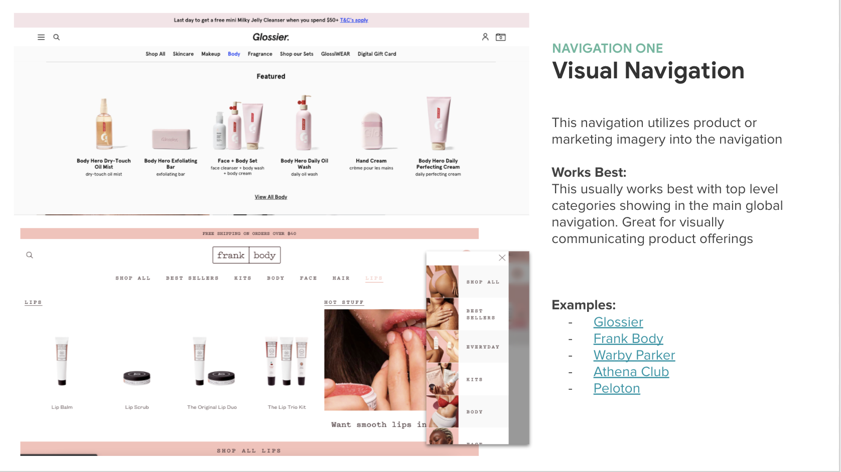
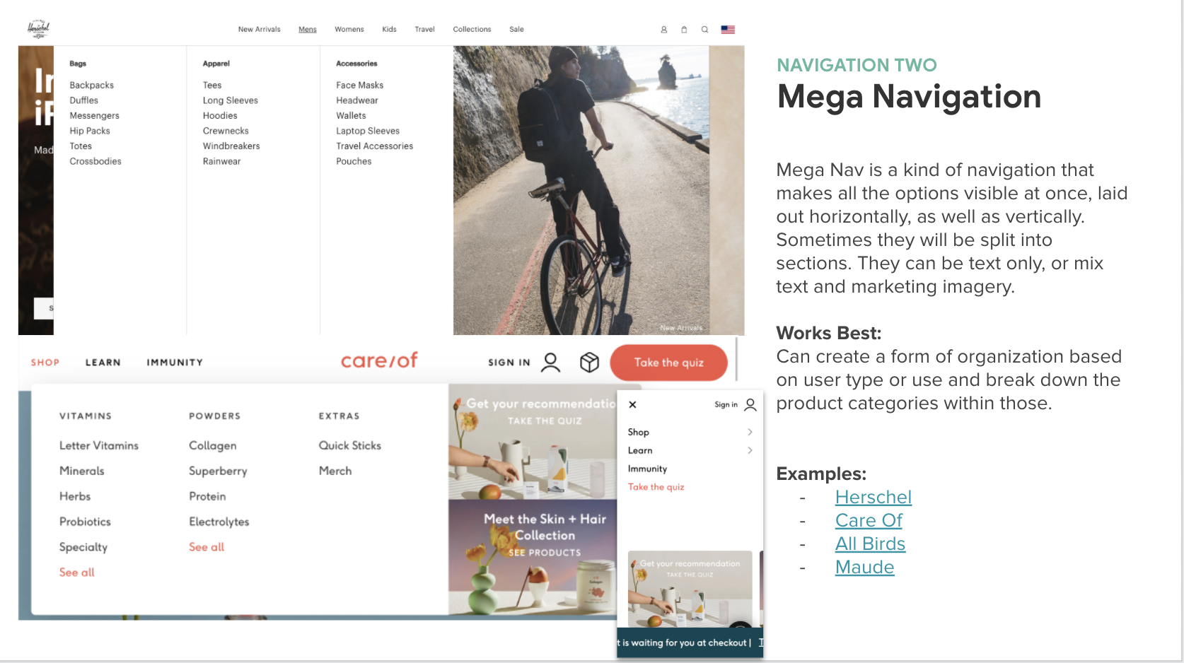
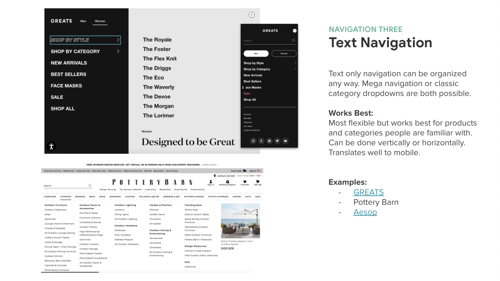
In addition to card sorting, we took a look at some of our competitors and other ecommerce sites for inspiration. From there, we showed stakeholders a few different navigation design approaches, including visual navs, mega navs, and text-focused navs. We also noted that majority of the sites we looked at prioritized products and shopping more then we were.
Design Process & Handoff
2 Options
After conducting competitive analysis and open card sorting, we then came up with with 2 different approaches that were more product focused:
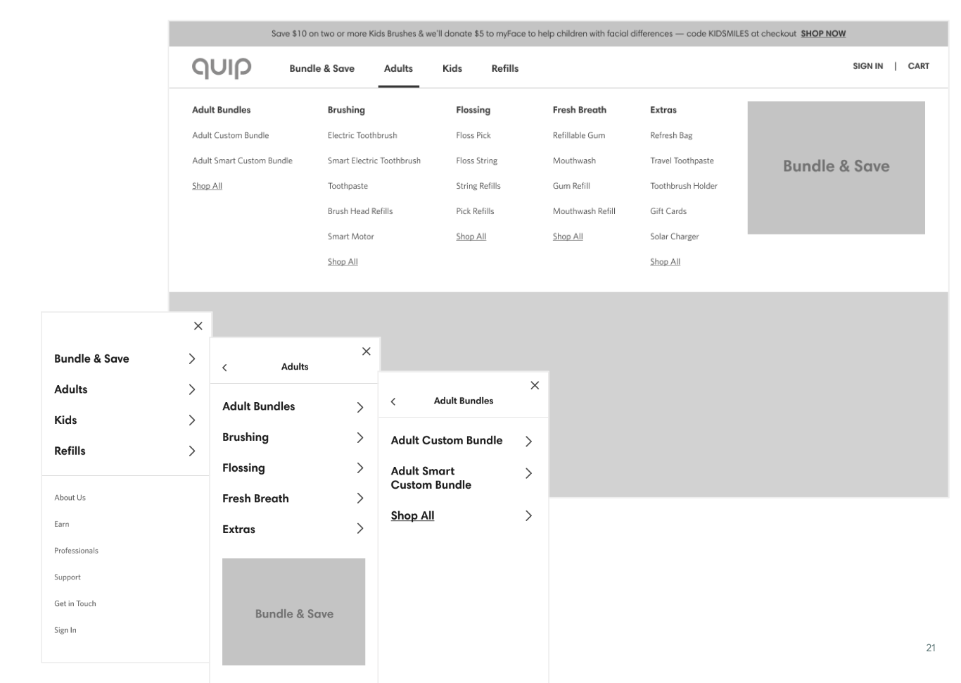
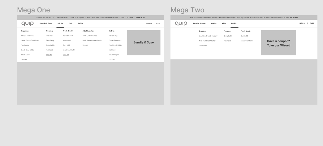
1: Vertical / Mega Approach
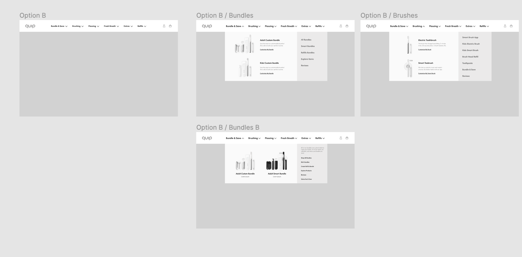
This type of sitemap pairs well with a mega-nav design approach, where there is much room and space to grow and evolve, and follows what quip already has. The 4 main categories were drawn from user testing (pulling out kids and bundles) and further dividing up our products under adults.
2: Horizontal / visual Approach
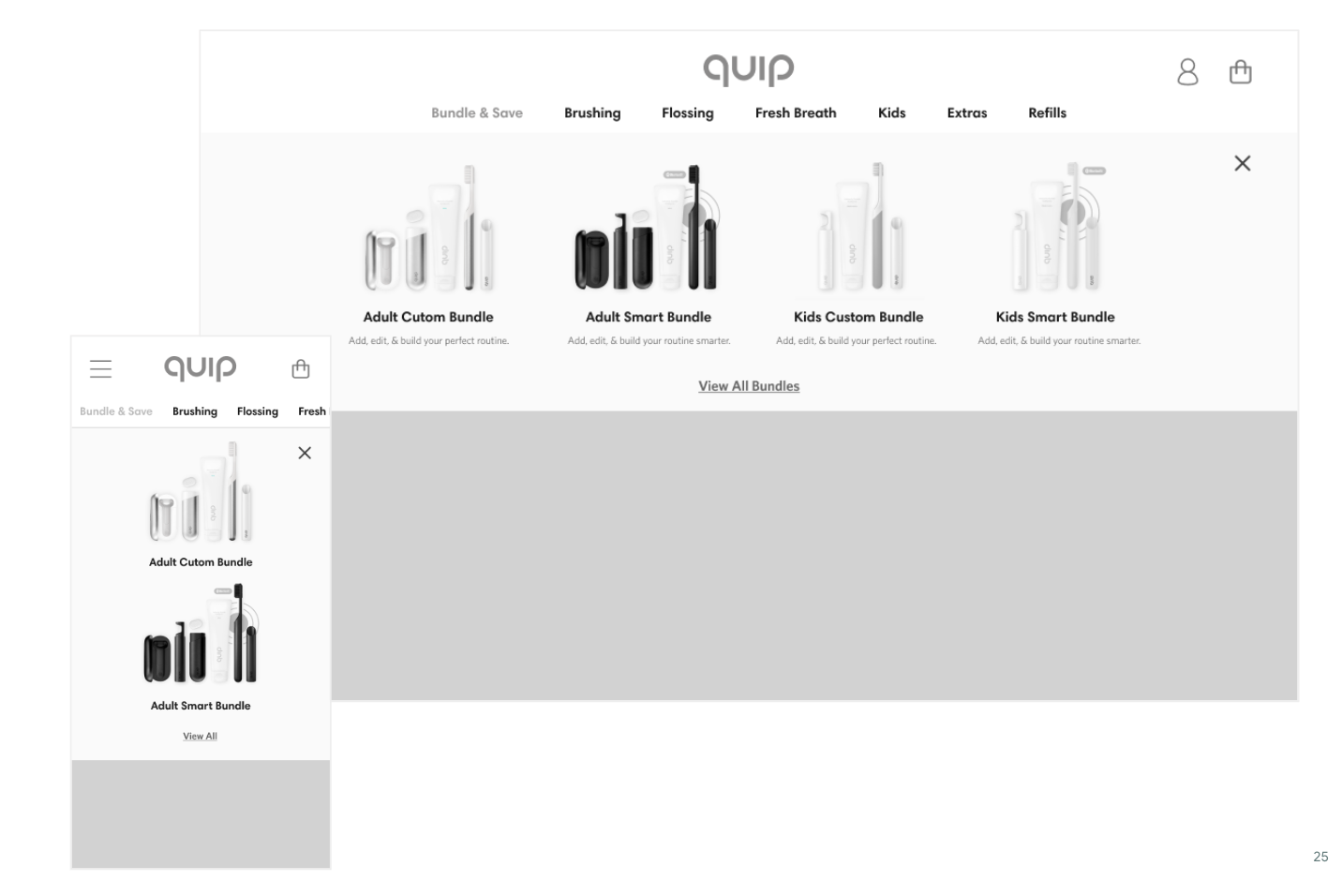
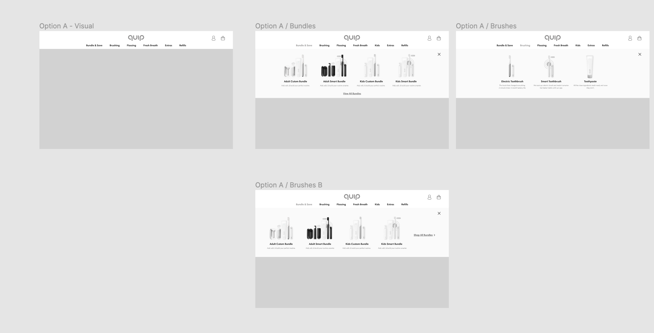
This approach brings our product categories to the forefront. One benefit of this navigation is that users know exactly what quip sells without having to hover, click or scroll. This type of sitemap pairs well with a more visual navigation, where we can feature more imagery and product information.
Footer
For all approaches, we proposed moving all secondary pages to the footer making it more robust and discovery-focused:
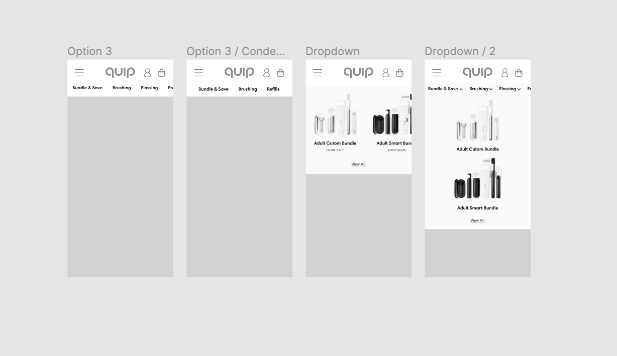
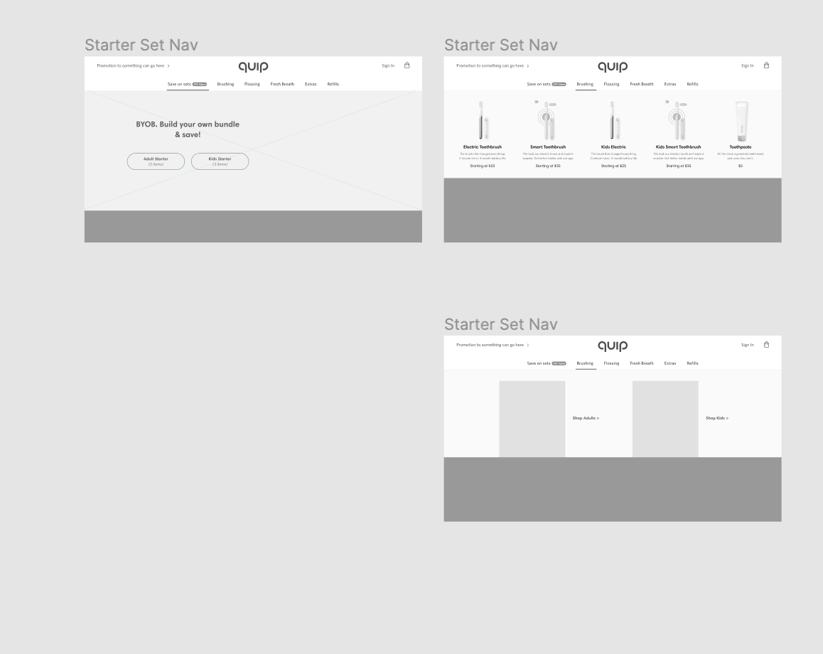
Option 2 Exploration
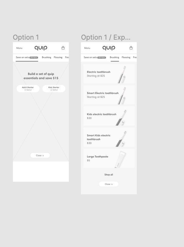
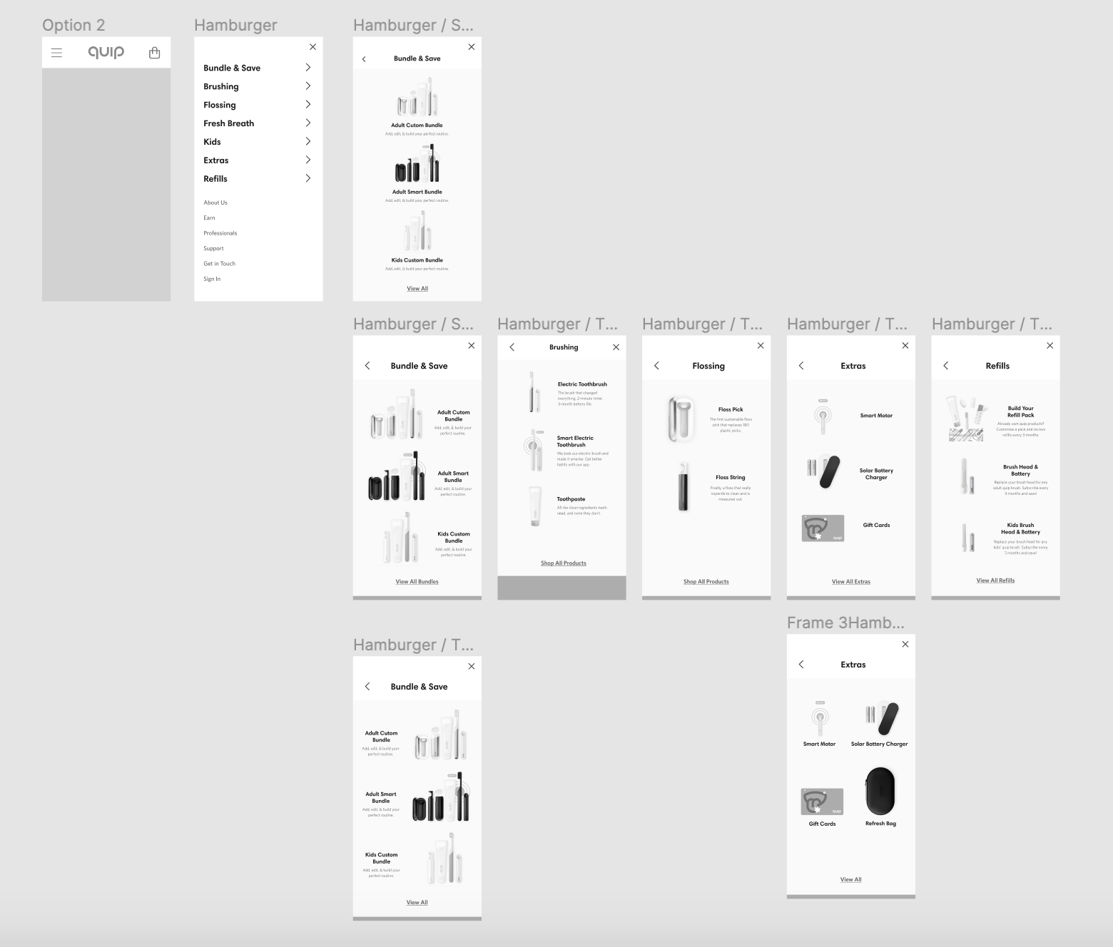
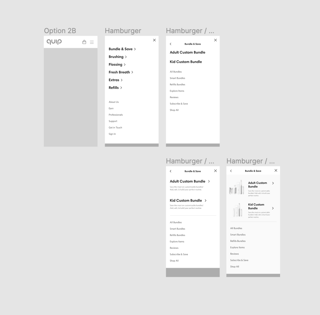
Once we settled on Option 2 based off of card sorting, we began mid-fi design explorations.
Mobile:
Desktop:
Final Design
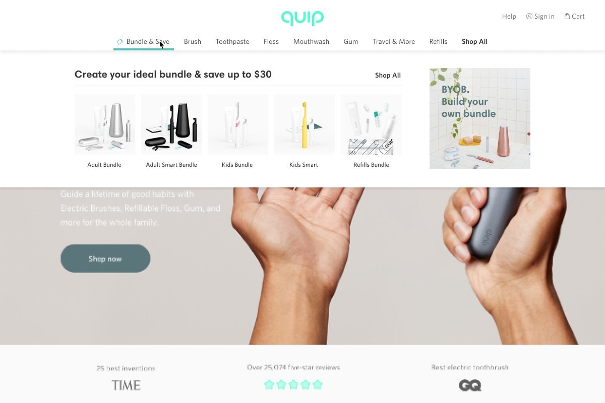
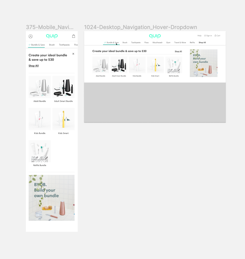
For the final direction, we settled on a visual navigation as it better displayed our products. With Contentful, an admin is able to configure the navigational items. We added a headline and promo area to further pull in the brand.
Handoff
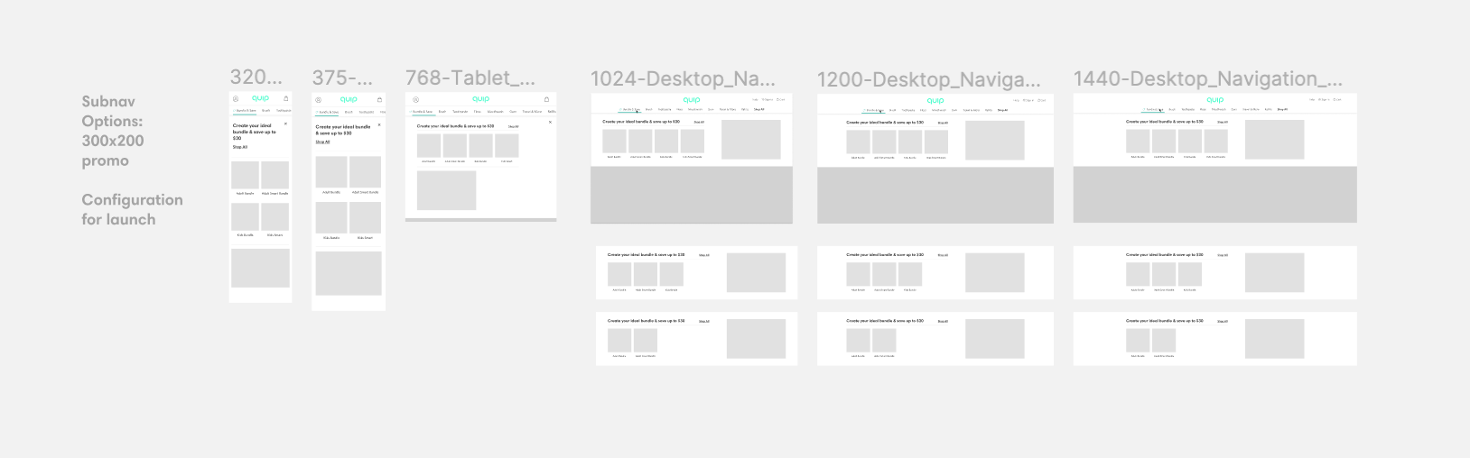
Once everyone was aligned with the design, I prepared figma files for handoff. A large of the engineering build was to make the navigation a component in contentful, so we met with the engineers to map out what elements would be configurable.
A/B Test
In order to validate that our new navigation was going to be successful, we ran an A/B test using optimizely. After running the test, where half of users had the old navigation and half had the new, we found that the new navigation improved PDP visits by 15% and CVR and LTR remained the same.
Next Steps
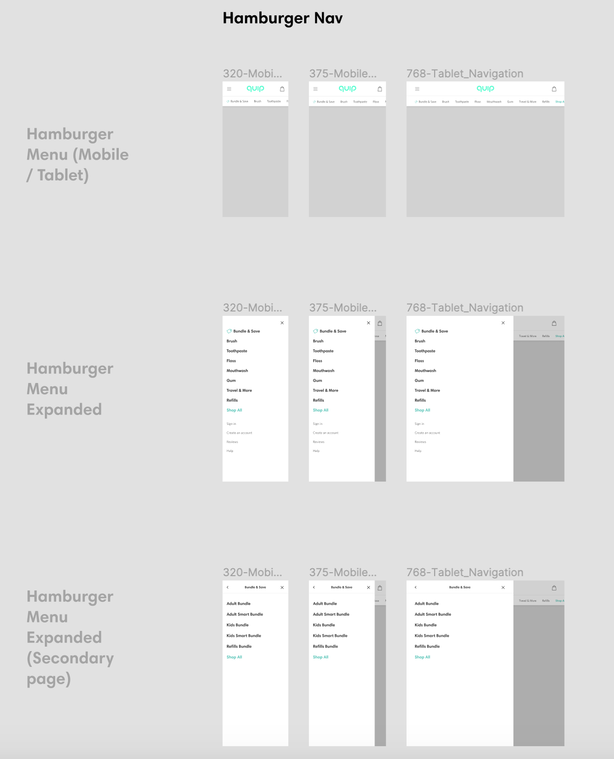
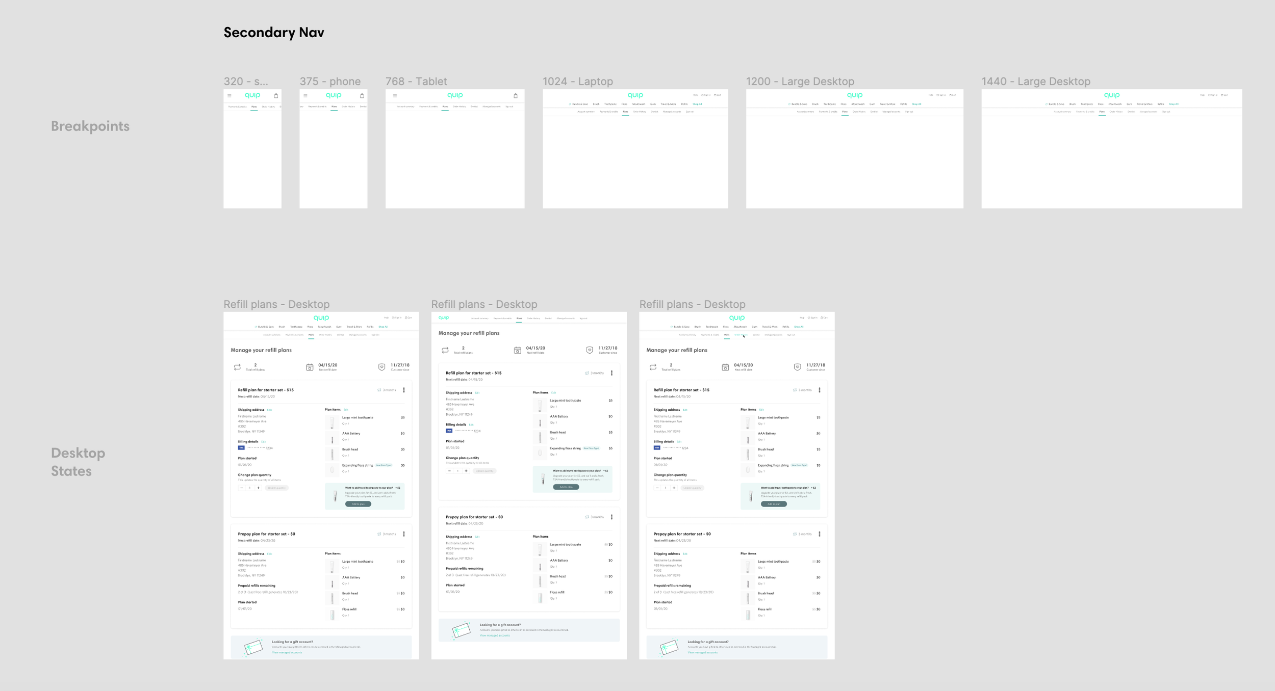
Hamburger & Secondary Nav
Becuase we eliminated a hamburger menu for MVP, we are planning on adding that to the mobile experience to give an additional mode of discovery. In addition, when we update the account menus, we will need to add a secondary navigation.
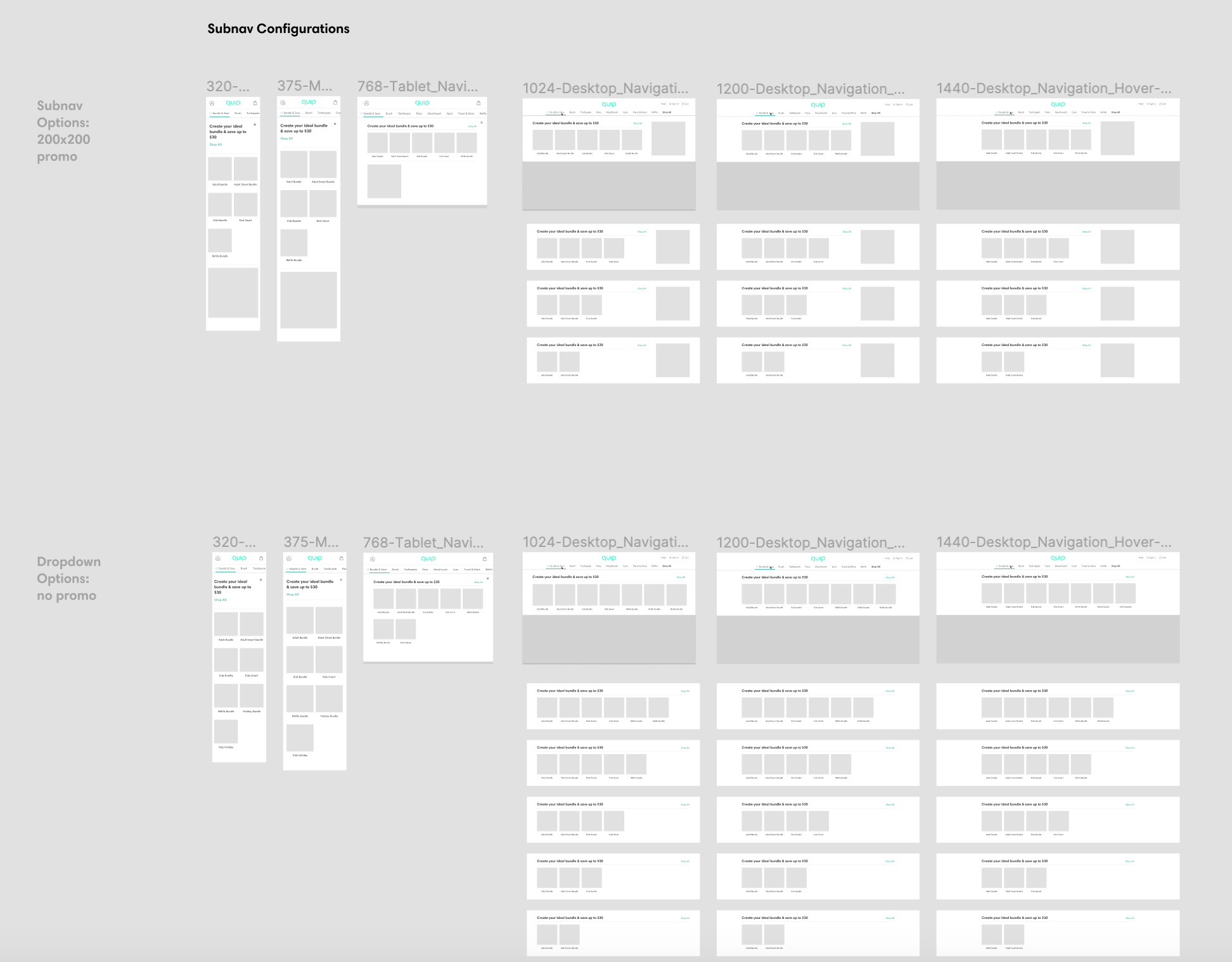
Promo Variations
Another area we wanted to address was giving marketing more flexibility for promotional real-estate and merchandising in our navigation. Below we offer a square promo with up to 5 items, and no promotional with up to 7 items.