
Overview
Summary
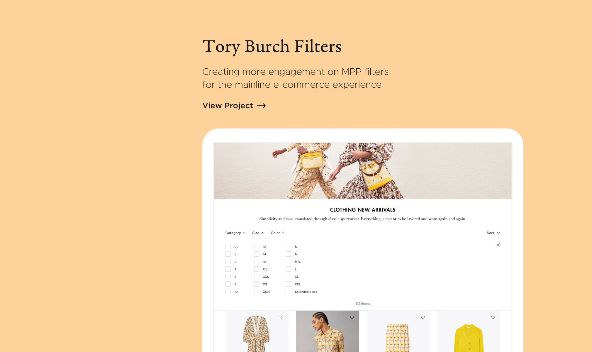
As a contractor at Tory Burch, I was tasked to redesign the filters on MPPs (multi-product pages) to increase engagement and help Tory Burch customers find what they are looking for.
Desktop Wireframe
Tory Burch
Tory Burch is an American fashion label founded by Tory Burch in 2004.
My Role
For this project, I was the lead UX designer working with product management, merchandising, creative, and engineering.
MVP Design Process
Problem
The current interaction rate with filters is very low, especially on desktop. I hypothesized that this was attributed to the filters being so small and off to the side, and there for easily being missed. In addition, the current interaction may cause confusion as you have to “apply” to see the results, yet the available attributes update in real time.
How can we improve the current filter design to increase engagement and help customers find what they are looking for?
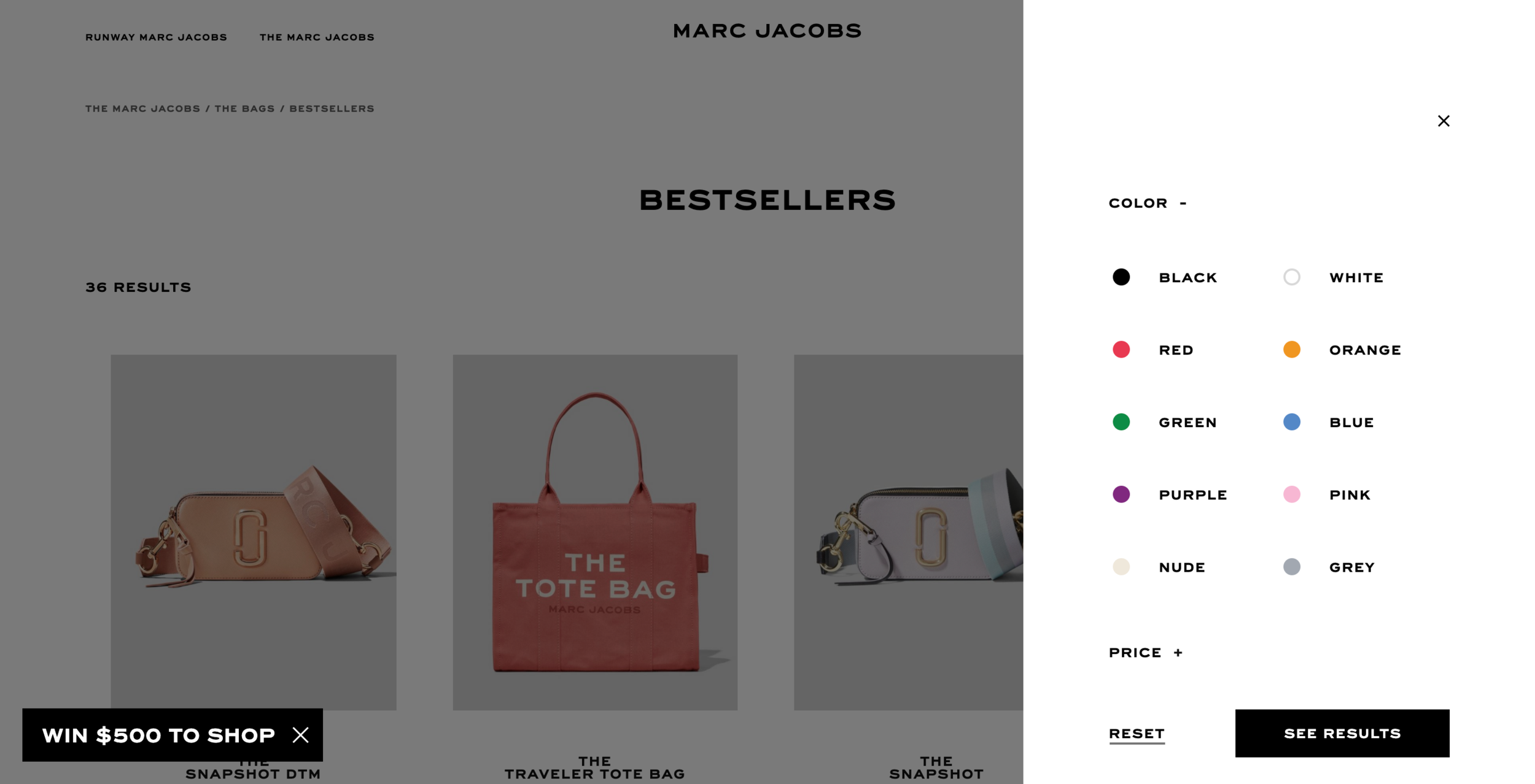
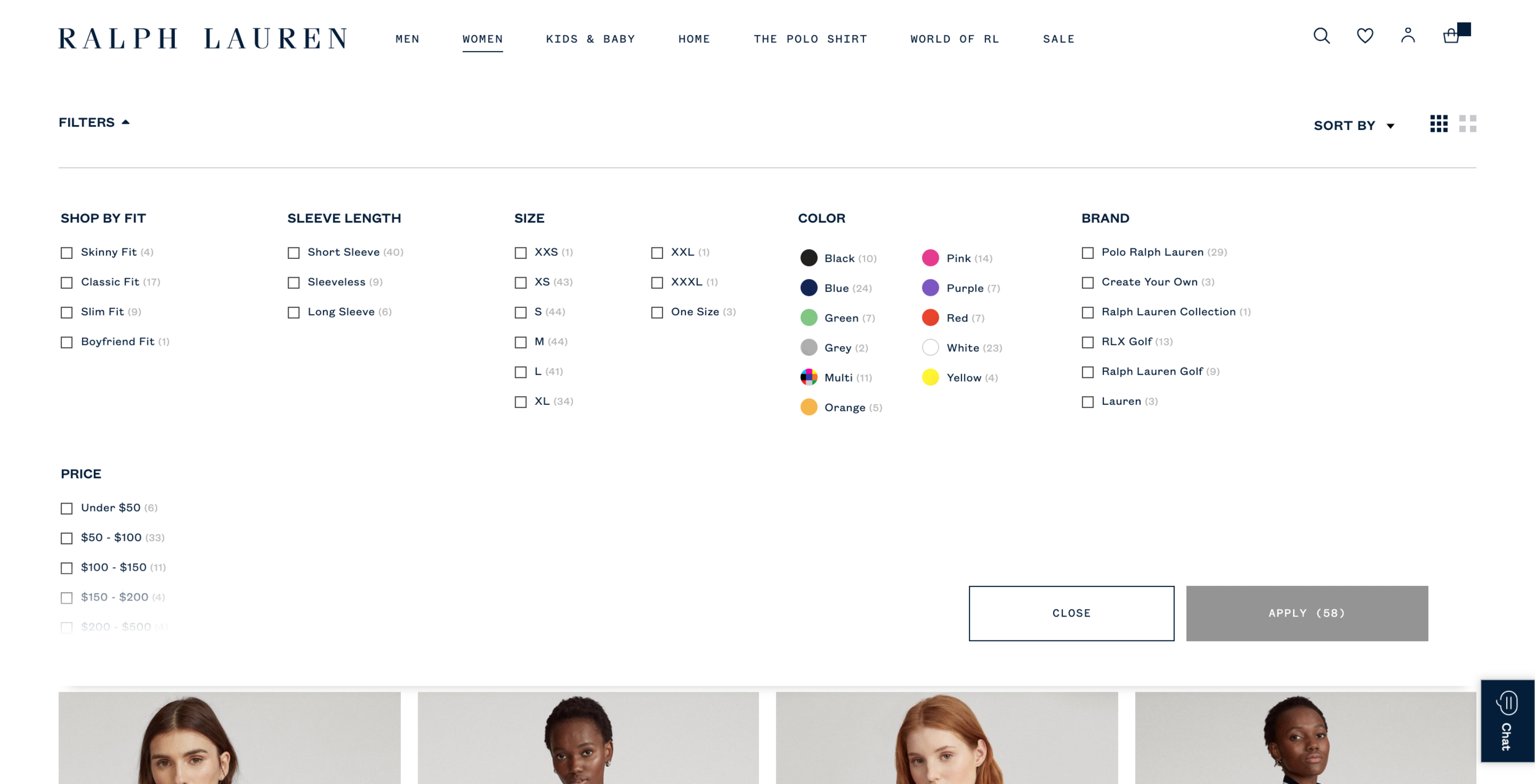
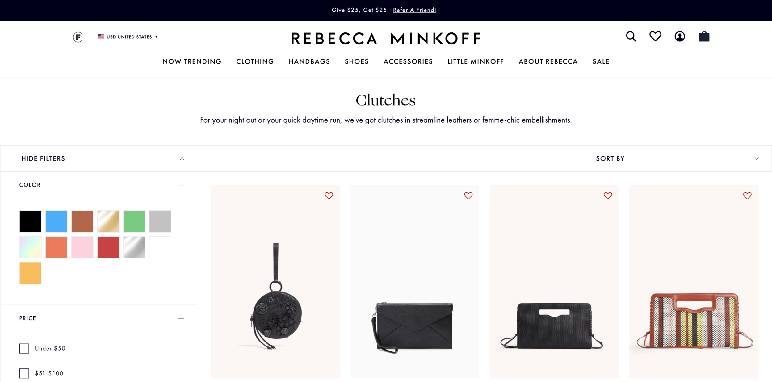
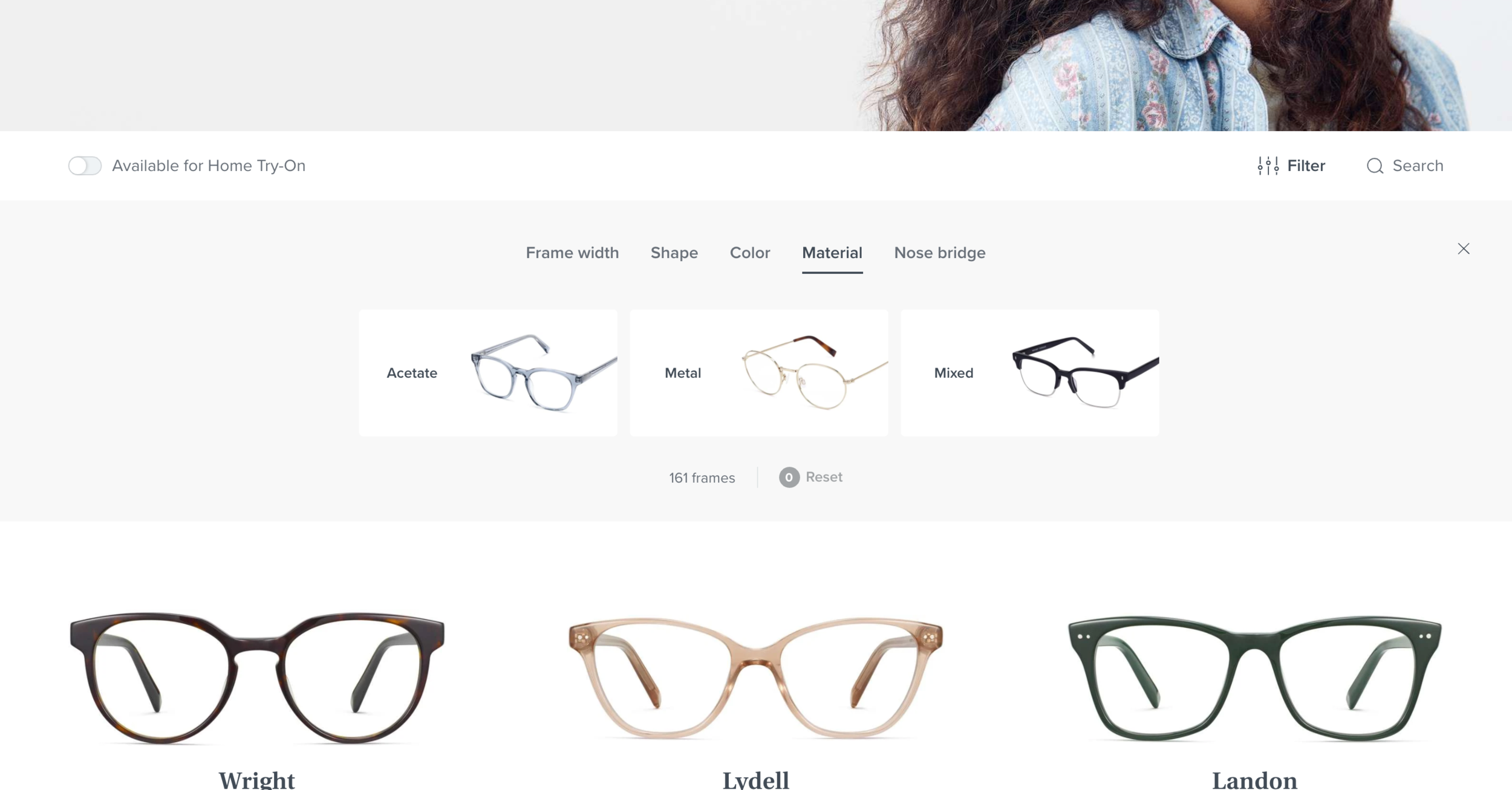
Competitive Analysis
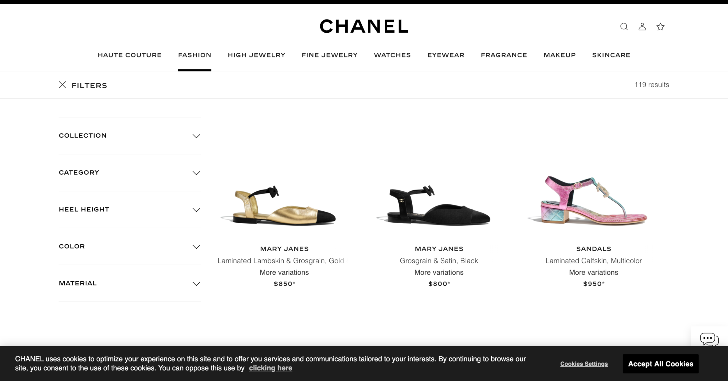
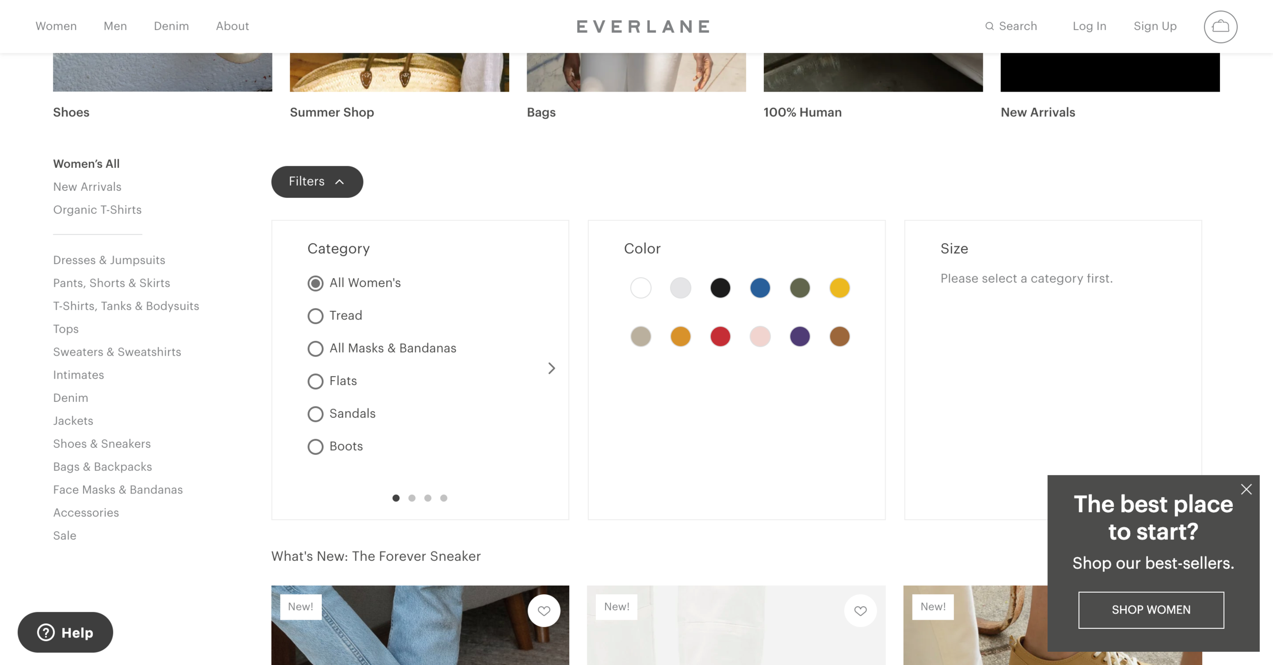
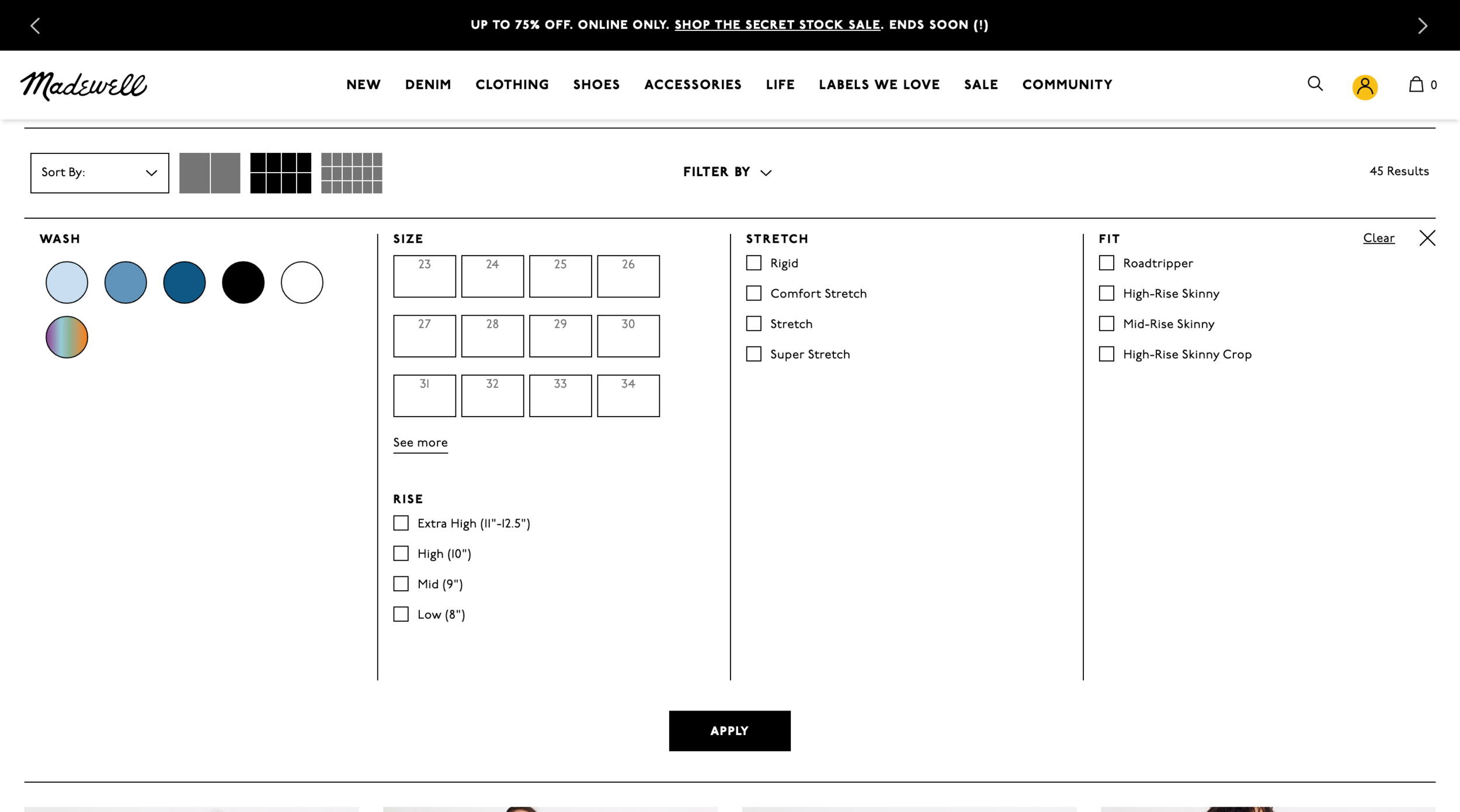
The first step I took was looking at the competitive landscape.

Ideation
Based on my competitive analysis, I knew I wanted to treat mobile and desktop separately. I first started with desktop, as it had the lowest interaction. After sketching out some ideas, I mocked up some ideas in Sketch, and then moved on to mobile designs.
Narrowing Options
After sharing with the product managers and creative director my ideas, we narrowed it down to two directions - both which exposed the different filters. I then flushed out both directions by prototyping out the full interaction on invision and shared them with the larger team.
Use Cases
After settling on a direction, I mapped out all of the different use cases to ensure that the new design fit different product categories and brands (Tory Sport).
Final Design
After flushing out use cases and consulting with the engineering team to plan how to build out this new feature, I packaged the designs for MVP.
For desktop, we decided to:
• Expose the filter categories
• Make it an in-line experience that will update the assortment in real time
• Make the filter area the full width of the screen
• Incorporate checkboxes and colors
• Moved number of items
• When an attribute is no longer available after selecting a filter, it grays out
For mobile, we decided to:
• Keep the filter entry the same (ie not expose all filter categories on MPP)
• Make filters and sort sticky as you scroll
• Create an accordion style menu to help better utilize space
• Pull in the same UI elements as desktop (eg carrot, gray out, color, etc.)
Launch
This feature was launched in early 2021. You can visit Tory Burch’s website to see them live and in action!
Future: Setting a Foundation for 2021 Roadmap
Mobile A/B Test
Depending on how mobile performs, there is a hypothesis that a more exposed approach could drive more engagement. Though mobile currently performs better than desktop and didn’t find the approach common in my competitive analysis, I did do some exploration around a potential future A/B test on mobile.
Visual Filters
Through my initial competitive analysis and ideation, I came up with suggestions around utilizing visual filters. During this time, the digital product team was brainstorming initiatives for 2021, and visual filters landed on the map! Though they were out of the initial scope, I provided designs for how the MVP could evolve into visual filters.
Collections Nav
In addition, one area I identified in my audit that could be improved was around collections. I hypothesized that users didn’t grasp what made each collection unique. Inspired by Madewell and Bonobos, I proposed a visual navigation component to help educate and guide users throughout the different collections.
Multi-CTA
Another area that came out of the MVP design process was addressing Mult-CTAs, links that are on some MPPs to help drive the user to other product. There are current issues with consistency and dead-ending the user, and with the new filters, there is an opportunity to better strategize. As a next step, the Tory Burch team is going to conduct some research to better understand the problem they were originally addressing.