

Overview
Summary
At Zola, I was tasked to design dynamic marketing modules for Zola’s PLPs (Product Listing Pages), which would be added and customized by our marketing and merchandising teams.
I designed and mocked-up how these modules would appear on the PLPs for desktop, tablet, and mobile, created guidelines and parameters for the marketing and merchandising teams, and worked with the front-end engineer in making them dynamic.
Zola
Zola is a mid-size tech start up in the wedding space, reinventing the wedding planning and registry experience.
My Role
For this project, I was the sole designer working with the shopping experience product manager, front-end engineer, and back-end engineer to determine what these modules will look like and how they will function.
Project Objective and Scope
Problem
When navigating the Zola shopping ecosystem, couples struggle to find the right gifts for their registries. Couples want to know what types of gifts to add, what would be the best item for them, and what promotions are happening.
In addition, with so many product options, trying to navigate and find the right item on the PLP experience can be overwhelming.
Solution
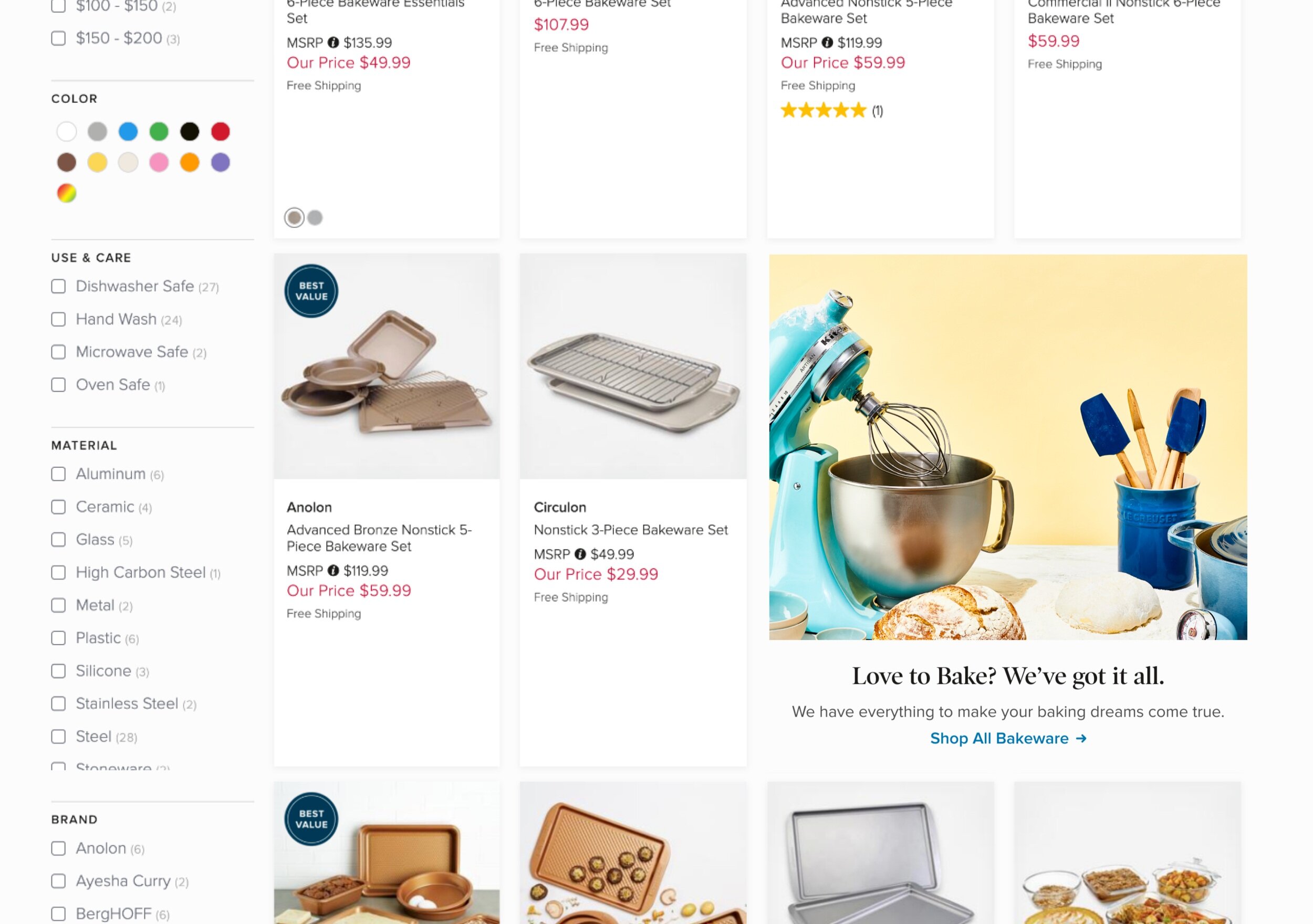
To address this problem, we added marketing modules on PLPs to help guide couples to the right gifts, content, promotions, and offers throughout the shopping experience.
These modules are curated, added, and managed through Zola’s admin portal, and appear on brand, category, and sub-category PLPs within Zola’s responsive web experience. There is a maximum of up to 3 modules on a given page, and are controlled by Zola’s marketing and merchandising teams.
Design Process
Competitive Analysis
Before diving into design, I first started with some research to see what some of our competitors were doing. Here are a few examples I looked at:


As you can see, there is quite a range of module size and design treatments. I really liked Warby Parker and Madewell’s modules, as they broke up their PLPs nicely, and drew heavily from Lululemon and Adidas’ component treatment.
Merchandising Needs
In addition to competitive research, I wanted to consider how our marketing and merchandising teams would be using these modules. I met with people from both teams, and looked at some of the existing promotional and educational materials to better understand the type of content that would be applied
From here, I understood that the module would need to have an image, with the option of a header, a sub-header and call to action (CTA).
Size Exploration
After getting some inspiration and better understanding the parameters, the first thing I explored from a design perspective was how much space should be dedicated to these modules on PLPs. I explored a more minimal approach (option 1) all the way to the maximum amount of space (option 4) for both desktop and mobile. I kept things to one row, as any longer felt disproportionate on mobile.
Mid-Fi Real Estate Options
I ruled out the 4th option early on, as many of our PDPs have hundreds of items, and I didn’t want for users to have to scroll even more so on desktop. In addition, the competitors that used this approach tended to have a very narrow product offering unlike us, so the large spaces filled out the pages more nicely for them.
Component Design
After exploring the size of these modules, I then did some ideation around the component design, i.e. what each element of these modules would look like. I knew I wanted the image to be large and emphasized, and played around with the copy and CTA treatments:
Mid-Fi Component Design
I narrowed down the options to 1, 2 and 5, as the text overlay for option 3 and 6 could prove difficult and restricting when it came to choosing an image, and option 4 didn’t feel as dynamic as the others.
High-Fidelity Mockups
After narrowing down some options, I created high-fi mockups to better understand what the different sizes and component options would look like on an actual PLP:
High-Fi Mockups
To ensure that the design would accommodate for different use cases, I also mocked up a few examples of exploration, promotional, and educational modules:
High-Fi Use Cases
Finalized design
After sharing these options with to stakeholders, we landed on the double width tile on both desktop and mobile, with a link below for the CTA.
Weighing the pros and cons of each option, we felt that a single tile got lost on mobile; that a double tile created the most contrast, and translated well from a responsive perspective. In addition, the overlaid button could get lost on a predominantly white image and the blue button felt too distracting.
Final Designs
Module Placement
With a maximum of 3 modules per PLP, we decided that to have fixed placement for the modules. This was to ensure the modules wouldn’t be too close together, and create less work for the marketing and merchandising teams. We decided on the 3rd row left (1), 7th row right (2), and 11th row left (3), always in that order, as it felt the most balanced.
Feature Build and Module Guidelines
Module States
Once the design was finalized, I mapped out all of the potential combinations, states, and sizes for the modules:
Module States
Dynamic Logic
I then worked with the front end engineer to determine how these modules would be dynamic, deciding on how the images would be sized, cropped, and appear on apparel PLPs (which had a longer tile length due to rectangular images). In addition, we decided to add a preview option in the admin experience, so the module creator would be able to see how it would look before pushing to the live website.
Guidelines
From this, I created recommended guidelines for the merchandising and marketing teams on how to best use these modules:
Launch
After conducting design QA, this project was launched in April 2020.
In order to determine if our solution addresses our initial problem, post-launch we will be looking at the following metrics:
Click-rate on modules
Increase adds to registry from PLPs with modules
Increase adds to cart from PLPs with modules
Increase promo codes entered at checkout